Struggling with color mismatches that damage your brand’s reputation and lead to costly production runs? These inconsistencies can frustrate customers and erode trust. Implementing a precise, Pantone-based quality control system is the key to achieving perfect color every time, protecting both your brand and your bottom line.
To guarantee color consistency, first select the exact Pantone color from a physical swatch book, never from a screen. Next, communicate this specific code to your manufacturer. Then, establish an acceptable color tolerance using a Delta E (ΔE) value. Finally, use a spectrophotometer under controlled lighting to measure and verify that every production batch matches your approved standard, ensuring uniformity across your entire product line.

Achieving that perfect color match is more than just picking a shade you like; it’s about creating a repeatable and objective process. When a client comes to us with a new project, one of the first things we lock down is the exact color specification. It forms the foundation of the product’s visual identity. Getting it right from the start prevents a lot of headaches later. Let’s dive into the details of how you can build a robust color quality control system for your own projects.
Why Is Pantone the Gold Standard for Color Matching in Manufacturing?
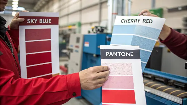
Relying on vague color descriptions like "sky blue" or "cherry red" is a recipe for disaster in manufacturing. Your idea of "sky blue" can be completely different from your supplier’s, leading to expensive rework and delays. The Pantone Matching System (PMS) solves this by providing a universal language for color.
Pantone is the standard because it offers a consistent, reproducible color reference system used across the globe. It eliminates subjective interpretation by assigning a unique code to each specific shade. This ensures that a product designer in Australia and a mold manufacturer in China are referencing the exact same color, which is critical for maintaining brand consistency.

When I first started in this industry, I saw a project get derailed because the client just sent a digital RGB value for a plastic enclosure. On-screen, it looked like a vibrant orange. But the plastic resin they chose couldn’t produce that same vibrancy. The first samples were dull and brownish. Had they started with a physical Pantone plastic chip, they would have known an exact, achievable color from the beginning. This is why a universal physical standard is so powerful. It grounds everyone in reality.
Understanding the Pantone System
The core strength of the Pantone Matching System (PMS) is its role as a universal translator for color. It was created to solve the problem of subjective color interpretation. Before PMS, printers and designers would argue over shades, costing time and money. Pantone created a book of standardized, numbered color swatches, and a global industry standard was born. This same logic applies directly to manufacturing plastic parts.
Why Not RGB or CMYK?
It’s a common mistake to use color systems designed for other media. RGB and CMYK are not suitable for specifying colors for physical products.
| Color System | Primary Use | How It Works | Why It’s Unsuitable for Manufacturing |
|---|---|---|---|
| RGB | Digital Screens (Monitors, Phones) | Additive color model (Red, Green, Blue light). | Colors vary wildly between screens and don’t translate to physical pigments. |
| CMYK | Four-Color Printing (Magazines) | Subtractive color model (Cyan, Magenta, Yellow, Black ink). | The range of colors (gamut) is limited and designed for ink on paper, not plastic resins. |
| Pantone | Branding, Manufacturing, Print | Standardized spot colors with unique codes. | Specifically designed for consistent color reproduction across different materials. |
This table shows why we insist on Pantone codes. RGB is light, CMYK is ink on paper, but a Pantone code refers to a specific pigment formula that can be replicated in plastics, paints, and textiles. This ensures what you see in the swatch is what you get in the final product.
How Do You Correctly Specify a Pantone Color for Your Plastic Parts?
You’ve picked a beautiful color on your computer screen, but the first physical sample from your manufacturer looks completely different. This common mistake can stop your project in its tracks, forcing frustrating and costly revisions. The solution is to use a precise, physical process for color specification from day one.
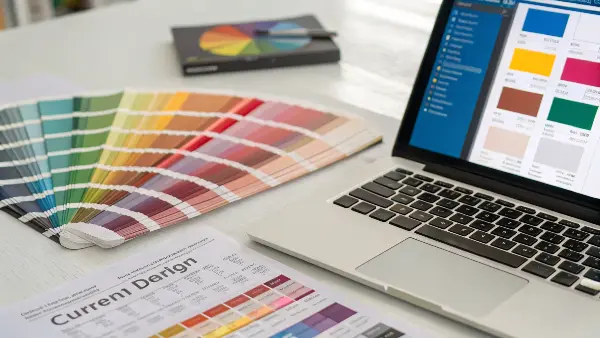
To correctly specify a Pantone color, always use a current, physical Pantone swatch book or plastic chip—never a digital screen. Identify the exact color code and finish (e.g., Coated, Uncoated, or a Plastic Standard). Clearly communicate this complete code to your manufacturer in your technical drawings and project documentation to eliminate any ambiguity.

A few years ago, we had a client developing a new line of kitchen gadgets. They sent us a presentation with their brand colors. The blue looked great on my monitor. But before we even ordered the masterbatch, I asked them to mail us a physical object that represented the color they wanted. When it arrived, the physical sample was a much deeper, richer blue than the one on the screen. By comparing it to our Pantone Plastic Standard Chips, we identified the correct PMS code together. This simple step saved them from producing thousands of units in the wrong color.
Step 1: Use the Right Physical Guide
Your first step is to get your hands on a physical Pantone reference. Screens are backlit and uncalibrated, making them unreliable for color selection.
- Pantone Formula Guide (For Print): This is the most common book, showing colors on coated and uncoated paper stock. It’s a good starting point for branding but remember that color appears differently on paper than on plastic.
- Pantone Plastic Standard Chips: This is the best tool for our industry. These are physical polypropylene chips that show exactly how a color will look in plastic form. They also show the color in different finishes (e.g., matte, gloss) and thicknesses, which is incredibly helpful.
Step 2: Communicate with Precision
Once you’ve chosen your color from a physical standard, you need to communicate it without any room for error. A vague instruction is not enough.
- Provide the Full Code: Don’t just say "Pantone 185." Specify the full name, like "PANTONE 185 C" (C for Coated paper) or, even better, reference the plastic chip ID, such as "PQ-185C". This tells us exactly which standard you are using.
- Include it in Technical Documents: Add the Pantone specification to your official Bill of Materials (BOM), CAD drawings, and your Request for Quotation (RFQ). This makes it a formal, contractual requirement.
By being this precise, you create an objective target that we, as your manufacturer, can work toward and be measured against.
What Are Color Tolerances and How Do You Define Them?
You’ve specified the perfect Pantone color, but when the production parts arrive, some are a slightly different shade than others. This variation, however small, can make your final product look cheap and inconsistent. The key to preventing this is to define and enforce strict color tolerances.
Color tolerance is the acceptable range of deviation from a master color standard. It is defined using a metric called Delta E (ΔE or dE). A lower ΔE value means a tighter, less noticeable tolerance. For most consumer products, a ΔE of 1.0 to 2.0 is considered a good, visually indistinguishable match for the human eye.

I remember working on a project for a medical device company where the housing had two interlocking parts made in separate batches. The color was a specific light gray. Individually, the parts looked fine. But when assembled, a tiny difference in shade was noticeable, which was unacceptable for a high-value medical product. From then on, we agreed on a very tight Delta E tolerance of less than 1.0 for all components of that product. It ensured every device that left the factory was visually perfect.
Understanding Delta E (ΔE)
Delta E is the "magic number" in color quality control. It’s a single number that represents the distance between two colors. Think of it like this: if your target Pantone color is a point on a map, Delta E is the radius around that point that you consider "close enough."
- How it’s measured: A device called a spectrophotometer shines a light on your master color standard and then on a production sample. It measures the color data from both and calculates the ΔE value between them.
- What the numbers mean:
- ΔE < 1.0: Not perceptible by the human eye. This is the goal for high-end products.
- ΔE 1.0 – 2.0: Only perceptible to a trained or highly observant eye. A common standard for quality consumer goods.
- ΔE 2.0 – 3.5: A noticeable difference is visible. Might be acceptable for less critical parts.
- ΔE > 3.5: The color difference is obvious. This is generally considered a failure in quality control.
Setting Your Tolerance Level
The tolerance you set depends on your product’s requirements and cost constraints. Tighter tolerances require more rigorous process control and can increase costs slightly, but they offer superior consistency.
| Example Product | Typical Delta E (ΔE) Tolerance | Justification |
|---|---|---|
| Luxury Car Interior Panel | < 1.0 | Brand image and high customer expectations demand near-perfect matching. |
| Consumer Electronic Housing (e.g., a Mouse) | 1.0 – 2.0 | Color consistency is important for brand perception but has some flexibility. |
| Internal, Non-Visible Plastic Component | 2.0 – 3.5 | Color matching is not critical as the part will never be seen by the end-user. |
| Disposable Plastic Container | > 3.5 | Function over form; color consistency is a low priority. |
When you kick off a project with us, this is a key part of our discussion. We work with you to define a ΔE value that balances quality, cost, and the practical realities of the manufacturing process.
How Do Environmental Factors Affect Color Perception During QC?
You have your master sample and a production part that the spectrophotometer says is a perfect match. But when you look at them under your office lights, they look different. This frustrating experience happens because environmental factors, especially lighting, dramatically change how we perceive color.
Lighting is the biggest environmental factor affecting color perception. Colors can look completely different under fluorescent office lights, natural daylight, or warm incandescent bulbs. This phenomenon is called metamerism. To ensure consistency, color evaluation must be done inside a standardized light box that simulates different lighting conditions.

This is something we have to educate our clients on all the time. A project manager once rejected a whole batch of parts because the color didn’t match the sample he had on his desk. He was sitting next to a big window, looking at the parts in bright, direct sunlight. Our QC lab had approved the batch under controlled D65 lighting (a daylight standard). I asked him to take the parts into a windowless room with standard office fluorescents. Suddenly, they looked like a perfect match. This shows why you can’t trust your eyes alone without a controlled environment.
The Problem of Metamerism
Metamerism is the enemy of color consistency. It’s when two colors appear to match under one lighting condition but not under another. This happens because the objects reflect light differently across the color spectrum. A spectrophotometer can predict this, but a visual check is still vital.
Creating a Controlled Viewing Environment
To combat these issues, a formal color QC process must control the environment.
-
Use a Light Box: A professional light box or viewing booth is non-negotiable for serious color control. It’s a sealed chamber with standardized light sources. The most common ones are:
- D65: Simulates average midday daylight. This is the most common and important standard.
- TL84 or CWF: Simulates cool white fluorescent lights, common in European and American offices and retail stores.
- Incandescent (A): Simulates warm, yellowish light from typical home light bulbs.
-
Standardize the Surroundings: The area around the samples matters. The inside of a light box should be painted a neutral gray (like Munsell N7). The inspector should not wear brightly colored clothing that could reflect onto the samples.
-
Check Viewer Acuity: Not everyone sees color the same way. People involved in visual color assessment should have their color vision tested regularly (e.g., using the Farnsworth-Munsell 100 Hue Test) to ensure they can accurately perceive subtle color differences.
By standardizing these factors, you ensure that when you and your manufacturer discuss color, you are both truly seeing the same thing.
How Do Different Plastic Materials and Finishes Affect Color?
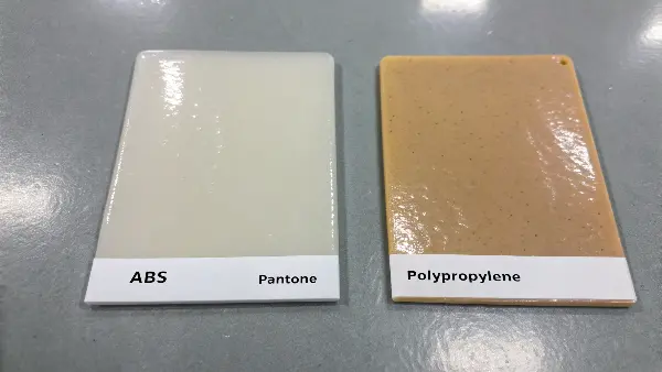
You’ve approved a Pantone color for a product made of ABS plastic with a glossy finish. Later, you decide to make a matching accessory out of polypropylene with a matte finish, using the same Pantone code. When the parts arrive, the colors don’t match. This happens because the material and surface texture dramatically alter how color is perceived.
A plastic’s base resin, texture, and gloss level all impact its final color. A glossy surface reflects more light, making colors appear more saturated and darker, while a matte, textured surface scatters light, making colors look lighter and less saturated. Different plastic resins also have their own inherent tints (e.g., yellowish or bluish), which can shift the final color.

We worked on a project for a set of outdoor furniture. The client wanted the chair shell (made of polypropylene) and the table top (made of acrylic) to be the same "sand" color. They gave us one Pantone code. We had to explain that achieving a perfect visual match would be impossible with one masterbatch formula. We ended up creating two slightly different masterbatches, one for each material, to compensate for the base resins and textures. The final products looked perfectly matched to the human eye, but the color formulas were technically different. This is the kind of expertise that makes a difference.
The Role of the Base Resin
No plastic resin is perfectly clear or neutral. Most have a slight inherent color cast.
- ABS (Acrylonitrile Butadiene Styrene): Often has a slightly yellowish or creamy tint.
- Polypropylene (PP): Can have a milky or hazy appearance.
- Polycarbonate (PC): Is generally very clear, making it a good base for vibrant, true colors.
- Nylon (PA): Tends to have a yellowish tint that can intensify with heat.
We have to account for this base color when formulating the color masterbatch. We might add a tiny bit of blue to a masterbatch for ABS to counteract its natural yellow tint.
The Impact of Surface Finish and Texture
The texture of the mold surface has a massive effect on the final color appearance. This is why mold finish standards like SPI or VDI are so important.
| Mold Finish | SPI/VDI Code | Visual Effect on Color |
|---|---|---|
| High Gloss Polish | SPI A-1 | Deep, saturated, rich colors. Hides nothing, shows all flaws. |
| Fine Matte | VDI 3400 Ref. 27 | Scatters light, colors appear slightly lighter and less intense. |
| Coarse Texture | VDI 3400 Ref. 40 | Heavily scatters light, making colors appear much lighter and desaturated. |
This is why, when we create a master color standard, we mold it into a plaque that has multiple textures on it. This allows the client to approve the color on a finish that is identical to their final product’s texture. It removes all the guesswork.
Conclusion
Mastering color quality control is not about guesswork; it’s about establishing a clear, objective, and repeatable system. By using the Pantone system, defining strict Delta E tolerances, and controlling environmental factors, you create a robust process that guarantees consistency from the first sample to the final production run.
