Are you struggling to keep your brand colors looking the same everywhere? Different printers and screens can show colors differently, making your brand look inconsistent and unprofessional. Using the Pantone Matching System (PMS) is the solution to ensure your brand’s visual identity stays strong and coherent.
The Pantone Matching System (PMS) guarantees color consistency by providing a universal, standardized color language. Each Pantone color has a unique code, ensuring that the exact same shade is reproduced on websites, business cards, product packaging, and manufactured parts, regardless of the material or production process used.

Getting your brand colors right is a huge part of building a successful business. It’s often the first thing a customer notices and remembers. But achieving that perfect, consistent look across digital screens, printed materials, and physical products is a real challenge. As a mold manufacturer, I’ve seen firsthand how a slight difference in color can completely change a product’s perceived quality. This is where understanding and using a system like Pantone becomes not just helpful, but essential. Let’s break down why this system is so critical for any serious brand.
Why is it important to think about colors when creating a brand identity?
Ever chosen a color for a project, only to find it looks completely different in the final product? This disconnect can weaken your brand message and confuse customers. A thoughtful color strategy is the foundation for building a memorable and impactful brand that people instantly recognize and trust.
Color is a fundamental element of brand identity because it’s a powerful and direct form of non-verbal communication. It shapes perceptions, triggers emotions, and increases brand recognition by up to 80%. A consistent color strategy helps a brand stand out from competitors and builds a strong, memorable connection with its audience.

When we started CavityMold, we spent a lot of time thinking about our brand. We knew our identity had to communicate precision, reliability, and expertise. Color was a huge part of that conversation. The right colors don’t just make things look good; they tell a story and set expectations. This is not just an artistic choice; it’s a strategic business decision that influences everything from customer perception to purchasing behavior. It’s the silent ambassador for your brand.
The Psychology of Color in Branding
Colors speak a language that our brains instinctively understand. They trigger feelings and associations that happen almost instantly. For example, blue often suggests trust and dependability, which is why so many financial and tech companies use it. Red can create a sense of urgency and excitement, perfect for sales and fast-food brands. Understanding this emotional connection is key. Before you choose a color, you have to ask what you want your customers to feel. Do you want them to feel secure, excited, or calm? Your color choice will be one of the most powerful tools you have to create that feeling.
Building Instant Brand Recognition
Think about some of the world’s most famous brands. You don’t even need to see their name or logo to recognize them. The specific shade of red used by Coca-Cola, the distinctive blue of a Tiffany & Co. box, or the purple wrapper on a Cadbury chocolate bar are all instantly recognizable. This is no accident. These companies have invested heavily in maintaining absolute color consistency across every single product, advertisement, and store. This consistency builds a powerful mental shortcut in the customer’s mind. When they see that color, they think of that brand. This is the level of recognition all brands should aim for.
Differentiating from Competitors
In a crowded market, standing out is a major challenge. Your color palette can be a powerful way to cut through the noise. Take a look at your competitors. What colors do they use? If everyone in your industry uses blue to convey trust, perhaps choosing a bold orange or a sophisticated gray could make you memorable. A unique color combination can become a signature for your brand, making it easier for customers to spot you and harder for competitors to copy. This is about carving out your own visual space in the marketplace.
| Color | Common Associations in Western Cultures | Industries That Use It |
|---|---|---|
| Blue | Trust, Security, Stability, Professionalism | Tech, Finance, Healthcare |
| Red | Excitement, Passion, Urgency, Hunger | Food, Retail, Entertainment |
| Green | Nature, Health, Growth, Wealth | Environmental, Wellness, Finance |
| Yellow | Optimism, Clarity, Warmth, Warning | Energy, Food, Automotive |
| Orange | Friendliness, Enthusiasm, Creativity | Tech, Arts, Retail |
| Purple | Luxury, Wisdom, Imagination, Royalty | Beauty, Luxury Goods, Education |
| Black | Power, Sophistication, Formality, Elegance | Fashion, Luxury, Tech |
| White | Simplicity, Cleanliness, Modernity | Healthcare, Tech, Apple |
What is the purpose of the Pantone Color System?
Have you ever tried to describe a specific color to someone? Saying "a light shade of blue" could mean a hundred different things. This ambiguity is a huge problem in design and manufacturing, leading to mistakes, wasted materials, and inconsistent branding. The Pantone system was created to solve this exact problem.
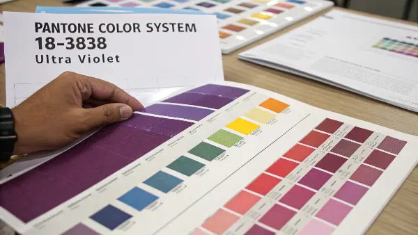
The main purpose of the Pantone Color System (PMS) is to create a universal and standardized language for color. It provides a definitive reference, ensuring that a specific color—like Pantone 18-3838 Ultra Violet—looks the same whether it’s printed on paper in Shanghai, woven into fabric in Italy, or molded into plastic in our facility.

I remember a project early in my career where a client specified a "deep ocean blue" for a new electronics casing. We went through three rounds of prototyping, and each time the client said the color wasn’t right. It was frustrating for everyone and cost us valuable time. After that, we made it a rule to require a Pantone code for all color specifications. This simple change eliminated the guesswork. Now, when a client gives us a Pantone number, we know exactly what they want, and we can deliver it with precision.
From Subjective Descriptions to Objective Codes
The biggest problem with color is that it’s subjective. My idea of "forest green" might be very different from yours. Factors like lighting, screen calibration, and even the material a color is on can change how we see it. The Pantone system replaces these vague descriptions with objective, standardized codes. Each color in the Pantone library has a unique name and number. This means a designer in Australia, like Alex our project manager user, can send a Pantone code to our engineering team here at CavityMold, and we both know precisely what color is needed. There’s no room for misinterpretation. This universal language is the bedrock of consistent global manufacturing.
Understanding the Pantone Libraries
Pantone isn’t just one single list of colors. It’s a collection of different systems, or "libraries," designed for specific industries and materials. The most common one for printing and graphic design is the Pantone Matching System (PMS), which includes guides for different paper types:
- C (Coated): For glossy paper, which makes colors appear more vibrant.
- U (Uncoated): For matte paper, where ink soaks in and colors look more subdued.
A single Pantone color, like Pantone 286, will have both a C and a U version because the same ink will look different on these two surfaces. For other industries, there are different systems, like the Fashion, Home + Interiors (FHI) System for textiles and paints, which uses TCX (Textile Cotton) and TPG (Textile Paper) codes. Knowing which system to use is crucial for getting the right result.
The Tools of the Trade
The Pantone system is more than just the famous fan-shaped swatch guides. Pantone offers a complete ecosystem of tools to ensure color accuracy from start to finish. This includes:
- Digital Libraries: Plugins for software like Adobe Photoshop and Illustrator, allowing designers to work with Pantone colors directly on screen.
- Capsure Devices: Handheld spectrophotometers that can scan a color from any surface—like a piece of fabric or a painted wall—and instantly match it to the closest Pantone code.
- Light Booths: Controlled lighting environments that allow you to view color samples under different standardized light sources (like daylight or store lighting) to see how the color will look in different situations.
These tools create a seamless and reliable workflow, connecting the designer’s digital vision to the final physical product with incredible accuracy.
How does Pantone contribute to consistent colour reproduction in various industries?
Imagine a brand that sells coffee. Its iconic green logo needs to look the same on its paper cups, its plastic lids, its employees’ aprons, and its website. Each material takes color differently. This is a huge challenge for large brands. How can they possibly maintain consistency?
Pantone ensures consistent color reproduction by acting as the single source of truth for color. By providing standardized formulas and references for thousands of colors, it allows different manufacturers in different industries (print, plastics, textiles) to produce the exact same shade of a brand’s color, creating a unified visual identity across all products and materials.

We see this challenge every day in the mold manufacturing business. A client will come to us with a design for a new product, and the color has to be an exact match to their existing brand palette. For plastics, we can’t just mix ink like a printer. We have to create a custom masterbatch—a concentrated pellet of pigment that is mixed with raw plastic resin. To get the color right, we rely on the client’s Pantone specification. It allows our material suppliers to create a masterbatch that will produce the exact color required once it’s molded.
Standardizing the Production Process
The magic of Pantone is that it standardizes the process, not just the color itself. For the printing industry, Pantone provides precise ink mixing formulas. A printer can use these formulas to create the exact shade of ink needed. For textiles, the Pantone FHI system provides dyed cotton swatches as a physical standard to match against. In our industry, plastics manufacturing, the process is similar. A client specifies a Pantone code from the Pantone Plastic Standard Chip collection. We then work with a color masterbatch supplier who uses that Pantone chip as the target. They use a spectrophotometer to analyze the plastic chip and create a pigment formula that, when mixed with a specific type of polymer (like ABS or Polycarbonate), will produce an identical color in the final molded part. It’s a scientific process that removes the guesswork.
Bridging the Gap Between Materials
Different materials reflect and absorb light differently, which dramatically changes how we perceive color. A color printed on glossy paper will look brighter and more saturated than the same color on a cotton t-shirt or a matte plastic surface. Pantone understands this. That’s why they offer different color guides and standards for different materials. For example, a brand might choose Pantone 7462 C for its coated paper packaging and a corresponding Pantone TPG or Plastic Standard Chip for its other products. While the codes might differ slightly between systems, Pantone provides cross-referencing tools that help find the best possible match across materials, ensuring the brand’s visual identity remains cohesive.
Reducing Risk and Cost in Manufacturing
In manufacturing, mistakes are expensive. A production run of 10,000 plastic casings in the wrong shade of blue can be a disaster, leading to wasted material, lost time, and a delayed product launch. By using the Pantone system, we minimize this risk. Before we start mass production, we create a small sample of the colored plastic, often molded into a small plaque or chip. We send this physical sample to the client for approval. Because we both started with the same Pantone reference, approvals are much faster and more certain. This process, known as a color match submission, protects both us and the client, ensuring the final product meets expectations and avoids costly reprints or remakes. It’s a critical quality control step in our workflow.
What is the benefit of using Pantone colors in branding?
When you’re building a brand, every detail matters. But how do you make sure the color you choose on your computer screen is the same color customers see on your products? Miscommunication about color leads to weak branding and costly production errors. It’s a common but avoidable problem.
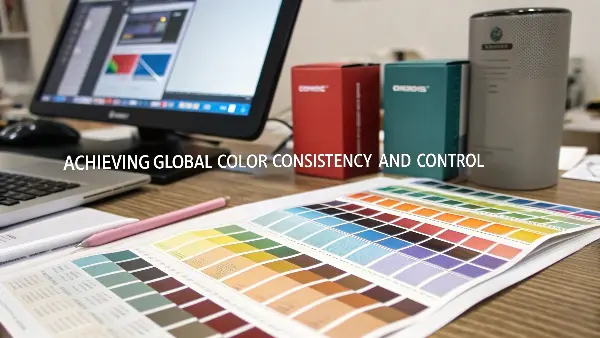
The main benefit of using Pantone is achieving global color consistency and control. It provides an objective, reliable standard that protects brand integrity anwhere in the world. This ensures your brand is instantly recognizable, builds trust with consumers, and saves time and money by preventing color-related manufacturing mistakes.

For a project manager like Alex, managing a product launch involves coordinating with designers, marketers, and multiple suppliers. The last thing he needs is a debate about whether the product’s color matches the packaging. By specifying a Pantone color from the very beginning, he sets a clear, non-negotiable standard for everyone involved. The designer uses the Pantone digital library, the printer uses the Pantone ink formula, and we use the Pantone plastic standard. This simple decision at the start of a project streamlines the entire process and ensures the final result is exactly what was envisioned.
Protecting Brand Integrity and Equity
Your brand’s color is a valuable asset. Over time, customers come to associate that color with your company’s quality and reputation. This is your brand equity. Inconsistent color dilutes this equity. If your products appear in different shades, it can make the brand seem unprofessional or, even worse, counterfeit. Using Pantone is like putting a trademark on your color. It ensures that no matter where your products are made or sold, they carry the same consistent visual signature. This protects your investment in your brand and reinforces its value in the minds of your customers. For example, Tiffany & Co. has trademarked its iconic blue, which is defined by a custom Pantone color, PMS 1837.
Streamlining the Design and Production Workflow
In any product development cycle, time is money. The traditional process of color matching can involve shipping physical samples back and forth between the client and the manufacturer, which is slow and inefficient. The Pantone system streamlines this entire workflow. A designer can select a color from a Pantone library in their design software. They can communicate that exact color code to the entire supply chain. At CavityMold, we can take that code and immediately start working with our material suppliers to create the right color masterbatch. This eliminates long, subjective approval loops and significantly shortens lead times. It allows teams to move faster and with greater confidence.
Enabling Effective Global Sourcing
Today, many companies work with manufacturing partners all over the world. A company based in Australia might have its packaging printed in Vietnam and its plastic components molded by us in China. How do you ensure color consistency across a global supply chain? The Pantone system is the answer. Because it’s a global standard, a Pantone code means the same thing in Sydney as it does in Shenzhen. It breaks down language and cultural barriers, providing a simple, precise language for color communication. This allows companies to confidently source materials and components from different suppliers globally, knowing that the final assembled product will have a perfectly unified and consistent look. It’s an essential tool for any modern, global business.
Conclusion
Ultimately, color consistency is not just a design detail; it’s a core component of your brand’s strength and reliability. The Pantone system provides the universal language needed to control your color across every touchpoint, ensuring your brand always looks its best and builds unwavering customer trust.
