Struggling to get the exact color you specified for your product? It’s a common frustration in manufacturing when a precise shade of blue turns up as a disappointing baby blue, leading to costly rejections and delays. This is where mastering color communication becomes critical for project success.
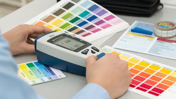
Precise Pantone color matching is achieved using a scientific instrument called a spectrophotometer. This device measures the exact spectral data of a color, essentially creating a unique digital "fingerprint." This data allows for the accurate reproduction of a specific Pantone shade across different materials, locations, and manufacturing processes, ensuring absolute color consistency for your products.

For any project manager in manufacturing, color is not just an aesthetic choice; it’s a technical specification. A slight variation can impact brand identity, product assembly, and customer perception. Getting it right the first time saves time, money, and your reputation. That’s why understanding the tools that guarantee color accuracy is so important. We need a system that removes guesswork and subjectivity. The journey from a digital design to a physical product must maintain color integrity at every step. This is the problem that Pantone, powered by the science of spectrophotometry, was designed to solve. It provides a universal language for color that we can all rely on.
What is the Purpose of the Pantone Matching System (PMS)?
Ever tried to describe a specific color over the phone? You say "forest green," but the supplier produces "lime green." This communication gap can cause major production headaches. The Pantone Matching System (PMS) was created to solve this exact problem, providing a universal language for color.
The primary purpose of the Pantone Matching System (PMS) is to ensure consistent and accurate color communication and reproduction across various industries and materials. It acts as a standardized reference, allowing designers, manufacturers, and clients to speak the same color language, eliminating guesswork and subjective interpretation. This guarantees that a color chosen in one location can be precisely replicated anywhere else in the world.

In my early days as an engineer, I worked on a project for a consumer electronics brand famous for its signature red logo. The project involved sourcing components from three different suppliers in three different countries. The first batch of samples came in, and we had three slightly different shades of "red." The client was not happy. It was a classic case of subjective color interpretation. One supplier’s "brand red" was warmer, another’s was cooler. This experience taught me a valuable lesson: color specification needs to be absolute. You cannot leave it to chance. The Pantone Matching System solves this by removing subjectivity. It assigns every color a unique code. Instead of asking for "brand red," I now specify "PANTONE 186 C." This simple change ensures every supplier, whether in Europe or Asia, is aiming for the exact same target.
The Core Benefits of PMS
The system is built on a foundation of standardization, which brings three key advantages to any manufacturing project:
- Communication: PMS provides an unambiguous code for every color. When I tell a toolmaker I need a part molded in PANTONE 293 C, there is no confusion about which shade of blue I mean. It’s the same language for my team in Australia, the mold maker in China, and the client in Germany. This clarity is essential for global supply chains.
- Consistency: Brands spend millions building their visual identity. That identity can be destroyed by inconsistent color. PMS ensures that the color of your product packaging matches the color of the product itself, regardless of the material—be it plastic, paper, or textile. This consistency builds brand trust and recognition.
- Control: With a defined standard, you have a clear benchmark for quality control. We can test finished parts against the official Pantone standard to see if they meet the specification. This makes acceptance or rejection decisions objective, not subjective.
To help you understand the different systems, here is a simple breakdown of the most common Pantone guides we use:
| Pantone System | Primary Use | Suffix | Description |
|---|---|---|---|
| Solid Coated | Printing on glossy/coated paper, plastics | C | This is the most widely used system for brand colors and logos. The "C" indicates the color’s appearance on coated surfaces, which is very relevant for shiny plastic parts. |
| Solid Uncoated | Printing on matte/uncoated paper | U | Shows how the same ink color appears on a non-glossy, porous surface. The color often looks darker and less saturated than its coated counterpart. |
| CMYK Guide | Four-color process printing | CP / UP | These guides show colors that can be achieved using Cyan, Magenta, Yellow, and Key (black) inks. It’s for standard printing, not for specific ink formulations. |
| Plastics | Pigment formulation for plastics | PQ / TQ | These are physical plastic chips that show how a color will look in a specific polymer. They are essential for accurate color matching in injection molding. |
How Does the Pantone Color Matching System Work?
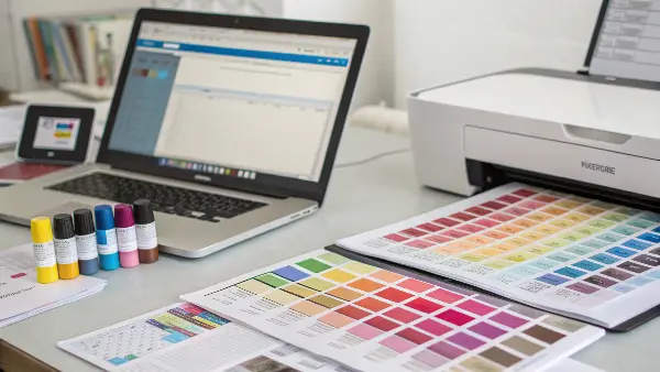
Sending a digital file with a specific color seems simple, but screens and printers all interpret color differently. The Pantone system works by replacing this digital ambiguity with a physical, repeatable formula, much like a recipe for baking a cake. It starts with a set of basic pigment inks that are mixed in precise quantities.
The Pantone system works by using a standardized library of numbered color swatches. Each color has a specific ink mixing formula created from a palette of basic pigments. This allows printers and manufacturers to physically mix inks or formulate pigments to create that exact color, ensuring consistency regardless of location. It’s a recipe-based approach to color reproduction.

The system is brilliantly simple in its concept. Pantone identified a set of base inks—like basic red, warm red, yellow, reflex blue, and so on. By publishing the exact proportions of these base inks needed to create thousands of other colors, they created a foolproof recipe book. For example, to get PANTONE 355 C (a vibrant green), the formula might tell you to mix X parts of PANTONE Yellow, Y parts of PANTONE Green, and Z parts of PANTONE Black. Any printer or manufacturer with these base inks can follow the recipe and produce the exact same color. It’s like a universal cookbook for color. This is why we can be confident that a color specified in our design software will match the final molded part. It’s not magic; it’s just a very well-thought-out system of recipes.
From Digital to Physical
The process of using the Pantone system in a typical project, like one we manage here at CavityMold, follows a clear path. It’s a process that ensures what you see on the screen is as close as possible to the final product.
-
Design and Specification: It begins with the product designer. Designers often use Pantone’s digital libraries within their software (like Adobe Illustrator). They select a specific Pantone color—say, PANTONE 7625 C, a terracotta orange—for a new product housing. This code becomes the official color specification in all technical drawings and documents.
-
Communication with the Manufacturer: When we receive the project files, that Pantone code is the single source of truth for color. We don’t have to guess what "terracotta orange" means. We communicate this PANTONE 7625 C code to our pigment supplier.
-
Pigment Formulation: The pigment supplier uses this code to create a masterbatch. This is a concentrated pellet of plastic containing the necessary pigments. They use their own recipes, cross-referenced with Pantone standards and often verified with spectrophotometry, to ensure the masterbatch will produce the correct color when mixed with the raw polymer (like ABS or Polycarbonate).
-
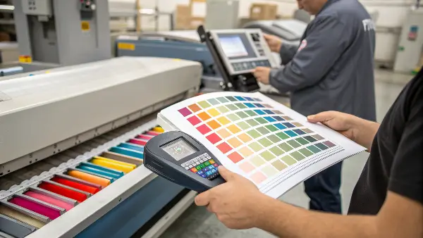
First Article Inspection (FAI): Once we have the mold ready, we produce the first samples using the specified polymer and the custom masterbatch. This first part is then sent to us and the client for approval. More importantly, we perform our own quality control. We compare the physical sample directly against an official Pantone Solid Coated guide under controlled lighting conditions to ensure an accurate match. This objective check is crucial before starting mass production.
This structured process, centered on the Pantone code, removes communication errors and ensures the final product meets the client’s exact brand requirements.
How Does Spectrophotometry Help Achieve a Precise Pantone Color?
Have you ever looked at a color swatch indoors and then taken it outside, only to find it looks completely different? Our eyes can be tricked by lighting, but a spectrophotometer cannot. This device is the scientific backbone that makes the Pantone system so reliable and accurate.
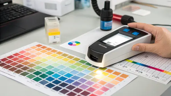
A spectrophotometer precisely measures color by shining a full spectrum of light onto a sample and recording the exact amount of light reflected at each wavelength. This creates a unique spectral reflectance curve—a "fingerprint" for that color. This objective data ensures a perfect Pantone match, free from human error or variations in lighting conditions.

I always explain this to our clients using an analogy. Imagine trying to identify a song. You could describe it—"it has a strong beat and a high-pitched singer"—but that’s subjective. A much better way is to use an app like Shazam, which analyzes the song’s acoustic fingerprint and tells you its exact title. A spectrophotometer does the same thing for color. It doesn’t "see" color the way our eyes do. Instead, it measures the physical properties of light reflecting off a surface. This measurement, called spectral data, is a series of numbers that uniquely identifies that color. It’s pure data, with no room for opinion or error. This data can be saved and shared globally, allowing anyone with a similar device to verify a color match to an incredible degree of accuracy.
The Role of Data in Color Matching
A spectrophotometer works by breaking down light into its core components. Here’s a simplified look at how it helps us in injection molding:
-
Setting the Standard: We start by measuring a physical Pantone reference chip with our spectrophotometer. This captures its "perfect" spectral data, which becomes our digital target. We are not just matching by eye; we are matching to a scientific standard.
-
Measuring the Sample: When we produce a plastic part, we then measure it with the same spectrophotometer. The device generates the spectral data for our molded sample.
-
Comparing the Data: The software then compares the sample’s data against the standard’s data. It calculates the difference between the two and provides a numerical value known as Delta E (or ΔE). This value tells us exactly how different the two colors are. A low Delta E value (typically under 1.0) is imperceptible to the human eye and indicates an excellent match.
Here’s how Delta E values generally translate to what we see:
| Delta E (ΔE) Value | Perceived Color Difference | Project Status |
|---|---|---|
| 0 – 1 | Not perceptible by the human eye | Excellent Match / Pass |
| 1 – 2 | Only perceptible through close observation | Acceptable Match / Pass |
| 2 – 10 | Perceptible at a glance | Borderline / May require adjustment |
| 11 – 49 | Colors are more similar than opposite | Fail / Requires reformulation |
| 100 | Colors are exact opposites | Complete Fail |
By using this data-driven approach, we can have objective discussions with our clients and pigment suppliers. If a color is out of tolerance, we don’t have a debate about opinions. We have data that shows the color needs adjustment, and the spectral curve can even give clues as to which pigments need to be adjusted to fix the problem.
How Can You Get an Exact Pantone Color Match in Your Products?
Ensuring a perfect color match isn’t luck; it’s a process. It requires clear communication, the right materials, and rigorous quality control from start to finish. Overlooking any step can lead to a color mismatch, even if you’ve specified the correct Pantone code.
To get an exact Pantone color match, first specify the correct Pantone code from a physical guide, not a screen. Provide this code and a physical sample to your manufacturer. They must then create a color masterbatch for your specific polymer and verify the first production parts with a spectrophotometer under controlled lighting.

I remember a project where a client specified a beautiful metallic gray for a device enclosure. They chose the color from their calibrated monitor and gave us the Pantone code. However, the chosen code was from the "Solid Coated" paper guide. When we molded the part in ABS plastic with metallic flake, it looked different. The texture, gloss level, and polymer type all influenced the final appearance. We had to work with them to select a color from the Pantone "Plastics" guide, which provides actual plastic chips. This experience highlighted a critical rule: the reference must match the final application as closely as possible. You can’t just pick a code from a screen and expect it to work perfectly on any material.
A Checklist for Perfect Color Matching
To help my clients, and now you, I’ve developed a checklist that we follow at CavityMold to ensure we nail the color every single time. Following these steps will dramatically increase your chances of success.
- 1. Use Physical Color Guides: Always, always make your final color selection from a physical, up-to-date Pantone swatch book. Screens are not color-accurate. Also, make sure you are using the right guide for your material (e.g., Coated for glossy surfaces, Plastics for molded parts).
- 2. Provide Both a Code and a Physical Standard: Give your manufacturer the Pantone code, but also send them a physical master sample if you have one (a painted part or a piece of the Pantone plastic chip). This gives them a tangible target to match.
- 3. Specify the Exact Polymer: Tell your manufacturer the exact plastic resin you will be using (e.g., Polycarbonate, ABS, PP). Different polymers can affect the final color. A color matched for ABS may look different in PP.
- 4. Define Acceptable Tolerance (Delta E): Have a discussion with your manufacturer about the acceptable Delta E value for the project. For tight branding colors, you might demand a ΔE of less than 1.5. For less critical internal components, a ΔE of 3.0 might be fine.
- 5. Demand a Masterbatch Drawdown: Before mass production, ask the manufacturer to provide a "drawdown" or a "color plaque." This is a small, flat sample of the actual plastic mixed with the color masterbatch. This is your best chance to approve the color on the real material.
- 6. Approve Under Controlled Lighting: When you receive the sample, evaluate it under a D65 or D50 lightbox if possible. This standardized lighting removes the variable of ambient light and allows for an objective assessment. Compare it to your physical Pantone chip.
- 7. Lock in the Masterbatch: Once you approve the color, ensure the manufacturer locks in that specific masterbatch formula and lot number for the entire production run to ensure consistency from the first part to the last.
Conclusion
In manufacturing, color is a science, not an art. The Pantone system provides a universal language, while spectrophotometry provides the scientific proof. Together, they eliminate guesswork, ensure consistency, and allow us to turn a creative vision into a precisely manufactured product that is right every single time.
